Do our results show emulating Microsoft may not always be a good idea?
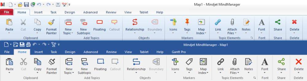
Over the last few months we ran a poll asking visitors to the site which style of Ribbon Menu they preferred in MindManager®. The two examples used were taken from MindManager 2016, released last year and MindManager 15, the previous edition. We decided to run the poll until we reached the 100 respondent mark and then share the findings.
We ran this poll to help us decide whether or not we should also change icons in our MindManager add-ins to match the new Microsoft style. At the moment we are still undecided.
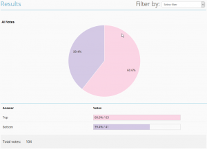
Well, “the results are in” and they indicate that just over 60% percent of you prefer the older style of icons to the newer, Microsoft styled ones.
Our Observations
 Let me jump in here and add that I am not a great fan of Microsoft style menu icons. In fact, I put off switching fully to Microsoft Visual Studio 2012/2015 for this very reason and will, at the moment, use Visual Studio 2010 for development where I have a choice. My reasons for this are not that I do not “like” the new icon style but that I find it very difficult to quickly associate a particular command or function with the icon.
What I find interesting is that many of the commands in MindManager have not moved position. The icon has simply been replaced with one devoid of many colors. This appears to have a dramatic impact on my ability to associate the icon with the command I want to use.
When I go to access a command I have used for years, located in its usual position on the menu, I find I actually have to “look” at the icon to confirm it is indeed the command I wish to execute. This has a huge impact on the speed with which I am able to navigate around the application and therefore my productivity time is impaired.
When switching back to the previous version of MindManager, I am once again able to “fly” around the interface, accessing commands without even thinking. The difference is very obvious to me and intrigues me because it all seems to be about COLOR.
It is as if my mind associated the command more with the pattern of color in the icon rather than the icon image itself. My instincts tell me that if the new icons used the old colors this issue would very likely disappear.
“You see, but you do not observe. The distinction is clear!”
The old Sherlock Holmes quotation above sums up my feeling on this. With the previous versions of MindManager I was able to “see” and did not feel the need to “observe”, the connection between icon and brain was almost instantaneous. However, with MindManager 2016 I am able to “see” with the relative same speed but for some reason I now also need to “observe” before I can confirm my action and press the mouse button.
So, for me and a good percentage of existing MindManager users, the move to copy the industry leader in this regard could be a step back. This is perhaps something a new user to MindManager would not suffer with, although it would be interesting to hear some feedback from new users of the application on whether they are able to identify commands without having to actually “observe”.
I’d love to hear your perspectives on this subject. Please join the discussion in the comments below.
0 Comments